
SKILLS

INTERACTIVE

GRAPHIC DESIGN

PHOTOGRAPHY


The Retail Installation showcases many skills and alternate experiences. A lot of thought and work went into creating these experiences. The installation required a total of 4 motion graphics promotional videos, which are shown to the user after they scan the corresponding QR code to activate it on a large projection or screen. Alongside the promotional videos, there are three separate stations including: an interactive catalogue, a rotating product, and a touchscreen ordering station. Each of these stations required to have a motion graphics screensaver which included the instructions on how to use the station itself.

More specifically, the interactive catalogue station is meant to allow the user to experience a different and unique way of shopping from a catalogue. This is done by incorporating physical products and light sensors to trigger animations and product displays. The rotating product station lets the user “swipe” through different product views in order to see different key features of that product. This station shows a full 360 view of a backpack, highlighting 4 different stop points to take in the features of the pack itself. Using a gesture controlled app, the user can experience a sense of augmented reality. The touchscreen ordering station is where a user can swipe through different clothing items to find the perfect outfit that they like. This station is more recognizable to users as they are common in popular places such as a fast food restaurant. This experience is advanced and allows the user to try an outfit without having to physically try the outfit on. After choosing the perfect outfit, the receipt prints out and can then be brought to a cashier for purchase and pick up.
Overall the stations are well thought out, with eye-catching animations and graphics to create an exciting user experience. A large amount of this project is motion graphics, using Adobe After Effects to create compelling videos with detailed instructional elements. Another big part of the project is illustrations and design elements created in Adobe Illustrator and Photoshop to pull together each station and allow for them to work cohesively with one another. The experience for the user is enhanced in the overall project by the use of GSAP animations to help with the flow and excitement of every small detail. Instructions including clear graphics and simple words were created with user experience in mind as well. The installation would not look good without thought out photography and videography, as it is used on several occasions throughout the experience. Overall, the entire installation was designed to be exciting, entertaining, easy on the eye, and simple to use.

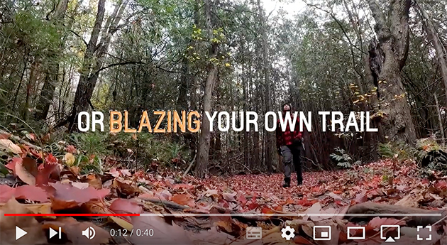
This is the very first station that someone should see. It is an engaging experience containing 3 promotional videos in one that promotes the brand and demonstrates the brands main focus and products to see in store. The video is in a loop and should pull the potential customer in and make them want to try the other stations. It shows a real-life user with the products in motion. This video can be projected onto a surface with a short-throw projector which allows a smaller space to be used. An additional part to this station is scanning the QR codes. It is an engaging experience that allows the user to scan one of 3 QR codes in order to see that corresponding video. Before scanning any codes, a simple video will be present with the branding showing at all times.

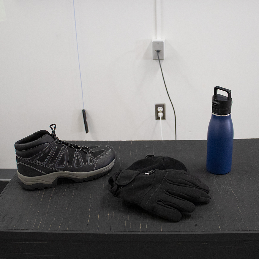
This station is an alternate input device. It is similar to moving or picking up a regular computer mouse, but has specific functions that occur after a user interacts with a product. When the user is at the interactive catalogue station, a screen saver will be up on a flat screen monitor to explain what the interaction will be and instructions on how to use the motion sensor product display. The instructions will stay on the screen saver until the user starts. Promotional elements will show on the screensaver to start the experience. Note that this screen saver will show up again after a specified idle time and reset the user experience. The user would then follow the instructions, select the product in which they would like to see/learn more about that specific collection, and that would take them into a different screen with additional instructions. This happens when the user picks up the product from the display and the light is exposed, letting the sensor work to display the new screen. The new screen shows the product images with the corresponding details on each item, along with more instructions on how to proceed. The user should then press the button behind the object that they picked up to see more information on the featured product. The user should feel like they can choose their products easier and more efficiently with this spin on shopping.

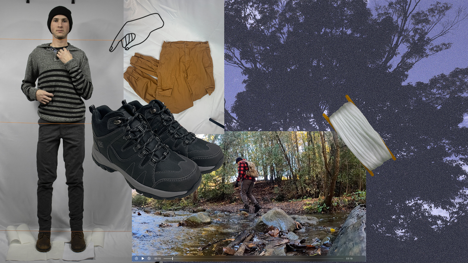
This station demonstrates a take on augmented reality by using an alternate experiential device to view a product. At the Rotating Product Station, the initial screen will be animated with some brief descriptions and instructions on how to use the device. The user will be prompted to interact with the product on the screen from watching the instructional tutorial animation. Note that this screen saver will show up again after a specified idle time and reset the user experience. This station will show a 360 view on the item (backpack) and highlight key information and details of various angles and sections. The user will interact by using the gesture controlled app, Leap Motion to make their way through the screens and information. The hand movements control everything at this station, which is ideal for users wanting to avoid touching the same areas as other users. Certain motions will show more information on the product and will let you return to previous screens. These movements will also show key points throughout the rotations. This station is exciting and engaging for users, showing a new way of technology.


This station is more common than the others, however it is advanced and very relevant in this period. The Touchscreen Ordering Station is where a user can swipe through different clothing items to find the perfect outfit that they like. The user will see fashion based motion graphics on the screen saver showing outfits and information promoting the clothing. A screen recording of the screens the user will be going through will be showing and instruction to begin will be consistently visible on screen at all times. Note that this screen saver will show up again after a specified idle time and reset the user experience. A variety of different garments will be available to see on human models so that the user can see what the outfit would look like together. The user can then view the details of each item including: price, colour, size, features, etc...
After the perfect outfit is created by the user, they can print out a receipt and bring it to the cashier to collect their outfit items. The ordering station saves time and effort when shopping, but also limits interactions and touch points, making it ideal for the world we have entered recently. The user should feel like they are trying the items on in a unique way. Ideally the user would see the promotional motion graphics videos first and want to experience more. They would then view/use the interactive catalogue and rotating product experience to learn more about the products that Traverse Outdoors has to offer. The touchscreen ordering kiosk would be used last to choose their outfit of choice so that they could bring the receipt to the cashier and leave happily with their products.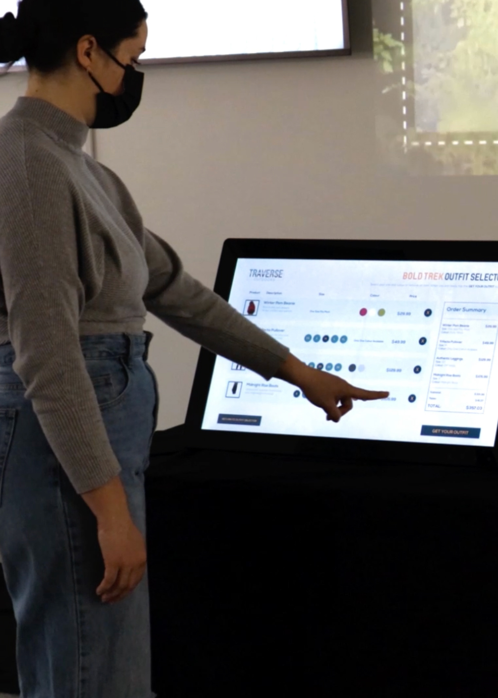

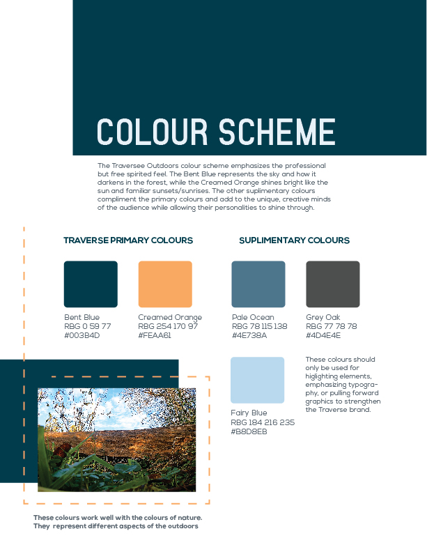
The installation came together after the branding was created. I chose to name my brand Traverse Outdoors because I wanted it to relate to the subject at hand. Traverse means to travel across or through. Hiking often involves both of these actions which lead me to the logo design with a path-like design going across and through the word “Traverse”. Branding should have a meaning behind it that can be talked about rather than just making a logo to have a logo there. It is the main graphic that people will remember and that people will see and talk about. As for the rest of the branding, it was best to keep it simple and use the dotted lines (path) throughout the installation and emphasize the other elements using the main colour scheme. This keeps the design clean and simple for easy viewing.
VIEW FULL BRAND BOOK HERE
 VIEW MARKETING MATERIALS
